
Once again, another week without a Tough Traveling (princesses, Nathan? princesses?!), but I have something better!
Our artistic wrassling over the War of Memory banner for SOE Live!
Yay art!
As always, these start out with my vague ideas, progress through a few rounds of bickering and corrections, and eventually end up in something we both find satisfying. I gave my initial directions in text form this time — which I should never do, because for all my ability to describe a scene, I seem to be terrible at explaining what I want in a picture.
D.’s first attempt to appease me:
 My response:
NO IT’S NOT SUPPOSED TO COME FROM THE MIDDLE IT HAS TO COME FROM THE SIDES LIKE THIS!
 Bask in the glory that is my artistic skill.
With that in mind, she tried some font options:
 As you’ll note, the ‘the’ is not capitalized in the last version — ditto for both of my covers. I really hate how overlarge and disjointed the capital T looks in this font, as you can see in the second option, and we went through a bit of dinkery to try to make it smaller/less weird but finally opted to go with what had already worked.
The fourth option would be the general path we took, but even that took a lot of hacking in the course of the banner-creation, because changing any little thing meant D. would almost certainly have to redo all of it. So there was a certain amount of her strangling me through the internet because I thought certain parts were too orange or not bright enough.
Moving on, she started adding the vines and tendrils!
 Maaaaaaybe too many vines and tendrils.
And a bit too green. Considering the types of vines seen in Book 2, I thought we needed a bit more variety in the colors…
(She also ended up making her own thorny-vine brush for this, and it looks so cool!)
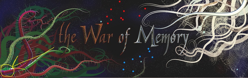
 With that base-work done, she started fancying the vines up.
 3D thorny vines!
Time to add embellishments to the tendril side!
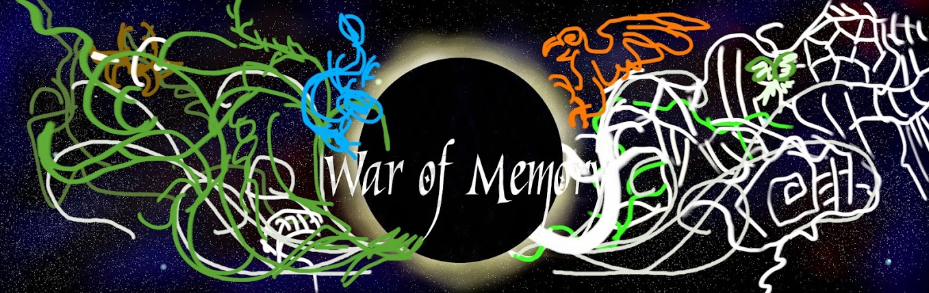
However, we decided that the brightness of the thorns was overpowering the text, so decided to scale it back a bit. We also added in the constellations — because that big dark spot in the center is supposed to be the Eye of Night, with the Phoenix and Leviathan constellations circling around it.
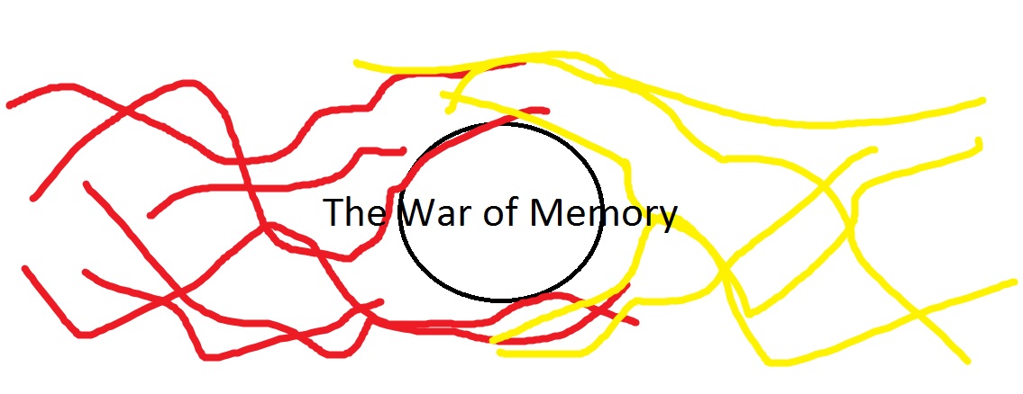
I’ve had these constellations in mind for a while now, but the only map of them that I ever drew was done about a decade ago, and I have no idea where it is now. Probably somewhere among my reams of notebooks and loose papers. So I made some new ones, in my own inimitable way:
 Yay dots!
To which D. responded with something that actually looked good.
 (Yes, some of the images are a bit out of order. Meh.)
After that came a whole lot of dinking around with the text, the 3D bits, tendrils, and other minor issues not interesting enough to showcase. At the end of the day (er…month) though, we ended up with the image below, which will be printed as the 6′ banner that goes on our booth!
 Click through on that one! The site will only show it so large otherwise.
Working on this was frustrating sometimes, because I hadn’t really thought of the series in an advertising manner before. Covers count for a bit, yes, but covers also have a particular format that doesn’t really translate here. But the process helped us figure out some ideas for a proper logo!
Which we’re still hammering at. Maybe next time!


Looks to me like all that effort was worth it – that last version is striking and evocative, and would certainly grab my attention.
I insisted on weaving a lot of the story’s elements into it, especially as I’m going into Book 3. Glad to hear it’s an eye-catcher!
Beautiful and memorable, H. I’d call that one a success!
Huzzah! 😀
Love it!
Thanks!