
Today, since I’m getting closer to my conventioneering debut, I shall share another piece of art my awesome cover artist D. D. Phillips has done for the project! This time, it’s the logo!
I know that not every fantasy series has a logo. Heck, not many do! But I grew up reading D&D novels like the Forgotten Realms and Dragonlance books, and since those are game-worlds as well as story-worlds, they all have cool-looking logos.
And heck, I always wanted my writing to focus more on the stories than on me as the author, so I’d much rather put a world-logo out there than my name.
As always, I had a few of my not-at-all-artistic ideas as to what a logo should vaguely look like.
![]() Fortunately, Deb is here to save me from myself.
Fortunately, Deb is here to save me from myself.
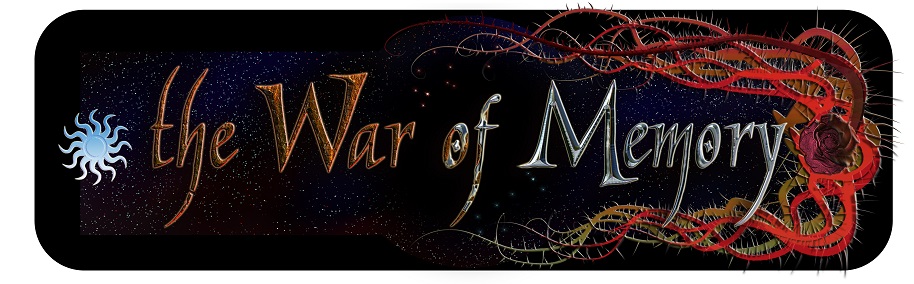
She took a look at that second option and immediately put something out that’s similar to the banner I showed off last time, plus the eye-in-rose from the Book 2 cover.
![]() I liked the tendrils/thorns being on these sides for color-balancing purposes, but I wasn’t sure about the big staring eye-rose.
I liked the tendrils/thorns being on these sides for color-balancing purposes, but I wasn’t sure about the big staring eye-rose.
So she went for something a bit less blatantly off-the-cover.
 Less pronounced rose here… But why’s the sun blue?
I mean, WHY’S THE SUN BLUE?
*shrug*
![]() THE SUN REALLY ISN’T SUPPOSED TO BE BLUE. ALSO THERE’S MAYBE TOO MUCH COBWEB FOR A LOGO.
THE SUN REALLY ISN’T SUPPOSED TO BE BLUE. ALSO THERE’S MAYBE TOO MUCH COBWEB FOR A LOGO.
Mmmkay…
![]() OKAY THAT’S COOL BUT IT NEEDS A BACKGROUND AND DUDE I SAID LESS WEBS.
OKAY THAT’S COOL BUT IT NEEDS A BACKGROUND AND DUDE I SAID LESS WEBS.
Yup…
 OKAY I LIKE THAT BUT THE SMUDGING I ASKED FOR DOESN’T LOOK GOOD AFTER ALL, EVEN THOUGH YOU TOLD ME IT WOULDN’T.
Uh-huh.
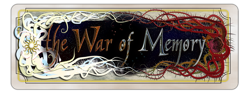
![]() I THINK IT NEEDS, LIKE, A NARROW CONTOURED BORDER THAT HAS SOME RELATION TO THE CARD, AND THEN I WILL ACT CONFUSED FOR A WHILE WHEN YOU ASK ME IF I INDEED DO NOT WANT THE CARD.
I THINK IT NEEDS, LIKE, A NARROW CONTOURED BORDER THAT HAS SOME RELATION TO THE CARD, AND THEN I WILL ACT CONFUSED FOR A WHILE WHEN YOU ASK ME IF I INDEED DO NOT WANT THE CARD.
Yep. That happened.
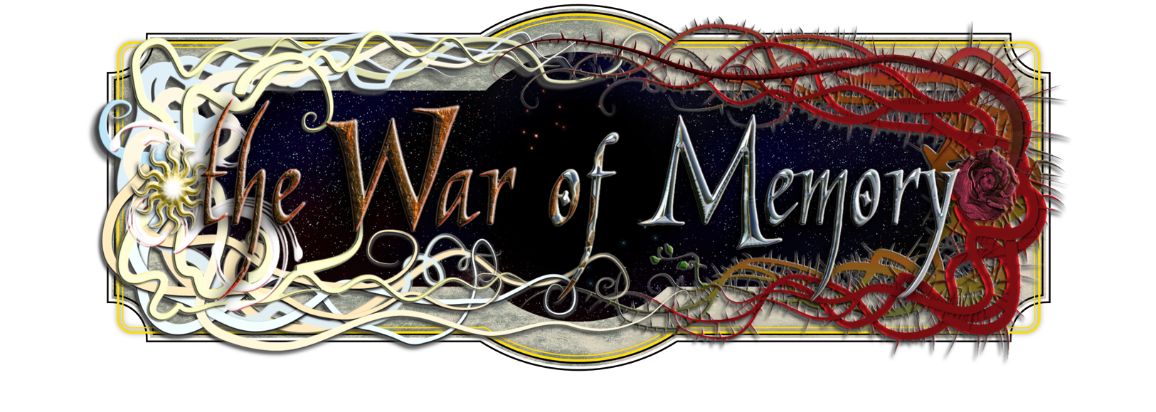
![]() OKAY I LIKE THAT MOSTLY EXCEPT I HAVE THESE EDITS AND ALSO IT KIND OF REMINDS ME OF A STREET SIGN.
OKAY I LIKE THAT MOSTLY EXCEPT I HAVE THESE EDITS AND ALSO IT KIND OF REMINDS ME OF A STREET SIGN.
*sigh*
 OMG YES THAT’S GREAT! NOW I’LL LEAVE YOU ALONE BEFORE YOU STRANGLE ME THROUGH THE INTERNET!
Finally.
Ehe…
Anyway, click through on that last one to see a bigger version. I badgered Deb to death on this one as usual, but it looks great! It will be on bookmarks at the convention, and I’ll probably stick it everywhere I can fit it once I get tired of using the banner as my website header.
Thanks Deb! You’re the best!


I only kill you a little, so i am much better than most. 😀
I love seeing the thought process through the life cycle of the project as well as the end product. 🙂
It’s fun to see how art progresses! We’ve considered doing something like a speed-paint or an animated .gif of the process, but her computer can’t handle the video-recording required for the former. Some day…