
Hi there, everyone who just showed up because Pauline M Ross is awesome! Nice to see you. I wasn’t planning on posting tonight — it’s a work night and my feet are sore — but then I remembered I had some images from Book 1’s cover work-up that I hadn’t aired before, so I might as well.
People who purchase the e-book don’t have the chance to see the full physical-version cover or the spine, so I’ll show it off here.
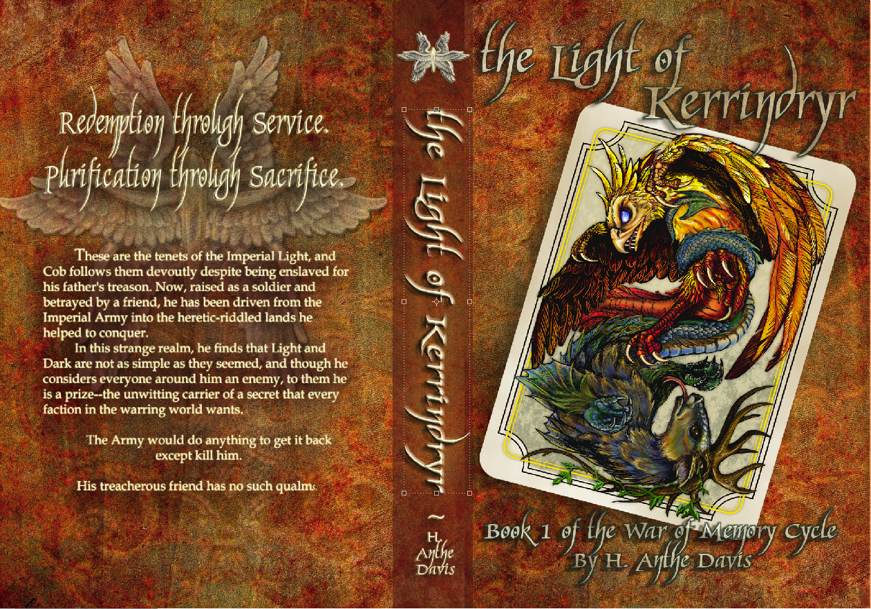 That’s obviously not the final version because it still has that little text-moving box around the title on the spine, but the final version is a pdf file and I don’t want to muck with it. So!
Brief discussion on the design. I specifically asked for my name to be at the bottom of the spine, because I work at a library and that’s where we place the spine label. I would much rather my name be covered up and the title displayed than vice versa; for one thing, a spine label will usually have my name anyway, or at least my last name, and for another, I don’t want the focus to be on me. I want it to be on the story.
Likewise I requested that the text on the back start a bit lower than usual, because in my library system we place the barcode at the top and I’ve seen too many first-lines and hooks get completely covered. I recognize not all libraries do this — one of our fellow systems in this state has its barcodes on the bottom, and many others print theirs inside the back or front cover or on the actual front page — but it seemed practical to keep the text in the middle. Some day it might be in more libraries than just mine, and I don’t want anything to get covered up.
I wish publishers were more aware of this when they sell to libraries, but again, each library system seems to have a different favorite spot.
Moving on!
The image that’s obscured by the back text can be seen a bit better here:
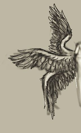
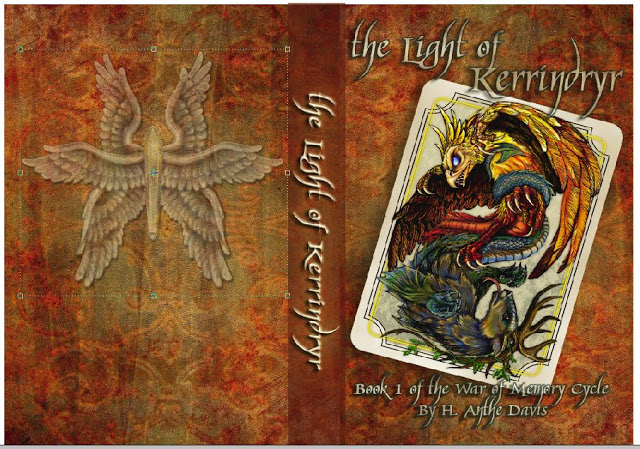 It’s a transparency of the little image at the top of the spine in the first pic, and for those who have read the book, I’ll tell you that it’s Sarovy’s winged-light pendant. Our work on it started with the image below:
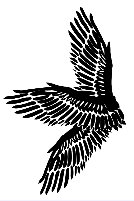
 That’s a composite of some stock wing-art and my own can’t-draw-a-straight-line attempt to delineate a crystal.
My artist friend countered with some wings of her own:
 Too stiff.
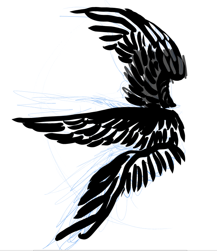 Wrong curve/positioning.
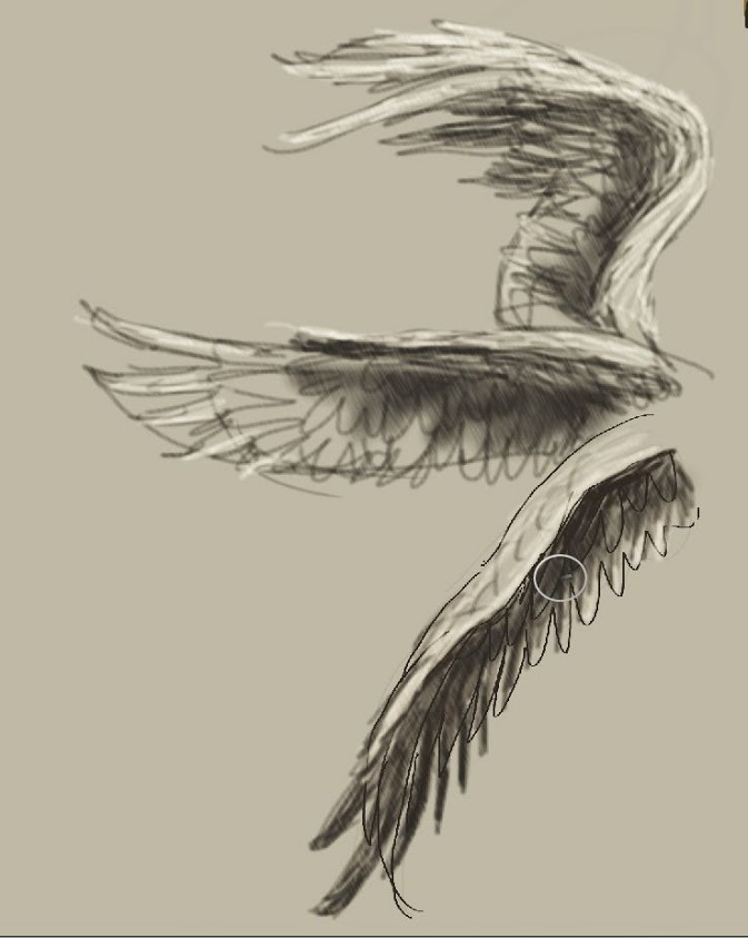 Closer, but…
 Yes! Like that!
 Look, a flying turd!
Brief intermission while she beats me.
 Good, but the glow is too low and defined.
 Almost there…
 DRAMATIC!
Personally I want to figure out how to cast that as jewelry for myself. I would wear it with my Loki (from the Avengers) dogtag and prance around and feel awesome. But we haven’t gotten that far with random paraphernalia yet, and I don’t have access to a 3D printer for the secondary option.
Though I might know a guy…


i know how to do lost wax casting – i prefer to just make the wax part though. molten metal in a centrifuge scares the pike outta me.
Yeah, that doesn’t sound dangerous at aaaaaaaaaaall.
I love that you work at a library and think about the placement of various tags and stickers. That’s awesome. I also like that your name isn’t larger than the title. It’s a niggling thing but I really hate it when I see the author’s name in huge letters with some obscure text for the title. Have you thought about having the book number on the spine? (Or is that too cheesy?) I find that when there’s a series I sometimes don’t know where to start and the number on the spine helps. I know that it’s on the front, but my eyes tend to flit around from place to place when I’m browsing books and sometimes I miss things.
Love the artwork!
I don’t think it’s cheesy, I find it helpful too. But from what I’ve seen from staring at book spines all day long, spine-numbers are only common among teen and younger books. Which is weird, because numbers are useful to everyone, but maybe the publishers think it’s juvenile somehow.
Seeing as I’m self-published, I could put numbers anywhere I wanted! I’ll keep it in mind for a second edition.
…I’ve also toyed with the idea of making my titles alphabetical, so that whether they’re sorted numerically or alphabetically on a shelf they’ll line up the same, but that was a little bit too librarian-nitpicky even for me.
That’s interesting. I guess people think that adults should be able to count. 😀